Color temperature
Color temperature
Abstrakcja and Minimalizm
Malarstwo współczesne
Lead time
Lead time
⏳ Delivery time
The order processing time depends on: the production technique, the drying time of the paints, the size of the image and any hand-finishing and protection.
🖼️ Art print on canvas
-
High quality canvas printing :
- Canvas - synthetic canvas 260 g
- Natural Canvas - 260 g cotton canvas
- Stretching the canvas onto the frame
- Quality control and packaging
Total completion time:
🎨 Oil Giclée Reproduction (print + hand-finished)
-
Giclée print on canvas:
- Canvas premium - natural cotton canvas 360 g
- Pigment print drying
- Hand finishing: texturing and oil painting
- Paint drying (depending on layer thickness, medium type and format)
- Stretching the canvas onto the frame
- Quality control and packaging
Total completion time: –
🚚 Ready-made paintings – shipped within 24 hours
Our gallery has a special category called "Ready-Made Paintings" - these are works available immediately, already stretched on a frame or in a ready-made frame.
- They are 100% ready for immediate shipment
- Safe packaging in a reinforced cardboard box
Shipping takes place within: from the date of booking the order.
Image format: Reprodukcja Oil Giclée
Need a different size? Contact us.
Couldn't load pickup availability
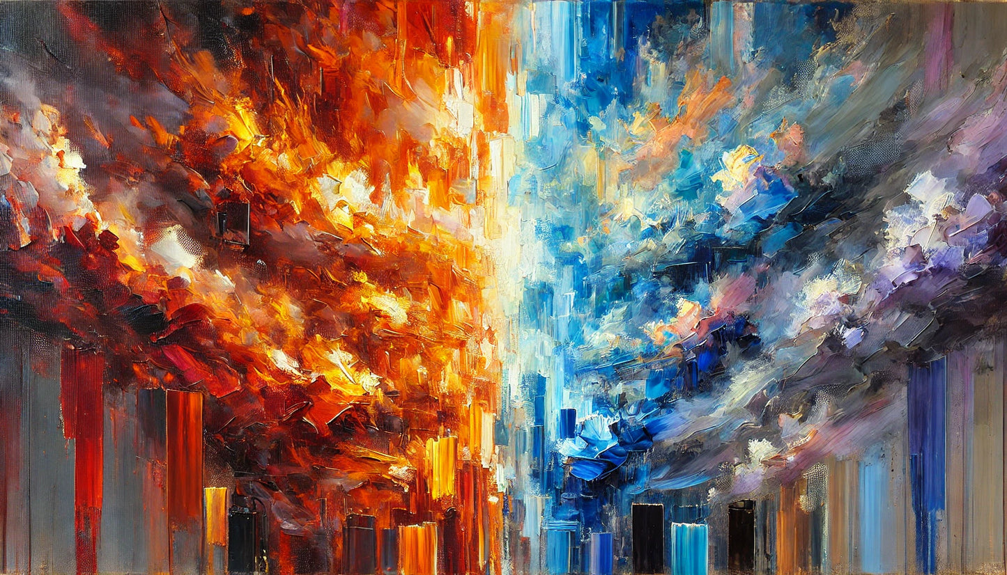
1. Title: "Color Temperature"
2. Description of the image:
"Color Temperature" is an abstract confrontation of emotions—a clash of fire and ice, passion and silence, light and shadow. The composition is divided not by line, but by sensation—one side blazes in deep reds, oranges, and yellows, the other soothes with cool blues, turquoise, and purple. Between them lies tension—a zone where colors enter into dialogue, sometimes harmonious, sometimes conflicting.
A painting doesn't tell a story—it tempers it. Each color has its own weight, temperature, and emotion. Each brushstroke is a pulse—rapid or quiet. This is a work that plays on the senses, balancing between inflaming and soothing.
3. Technique:
Oil on canvas – intense impasto and strong brushstrokes on the "warm" side; dry strokes and precise brushwork on the "cool" side. Layered color construction that creates space between contrasts.
4. Style:
Emotional abstraction – focused on the expression of color and gesture, with a clear division of moods. The painting resembles two personalities on one canvas.
5. Colors:
Extremely polarized – hot reds, embers of orange, and light yellows against the coolness of blue, the softness of turquoise, and the melancholy of purple. The palette acts like a mood thermometer.
6. Invoice:
Rich, energetic – heavier and more expressive on the "warm" side, more delicate and diffuse on the "cool" side. The transitions are palpable – as if you could touch the temperature.
7. Inspiration:
A clash of elements—fire and water, emotion and reason. The spirit of Ralph Hotere, Mark Rothko, and contemporary gestural painters who treat color as an experience.
8. Message and multidimensionality of interpretation:
It's an image of emotions that defy definition. It can be interpreted as an internal conflict, a state of equilibrium, a shift in mood, or a metaphor for relationships—two worlds that don't necessarily have to merge to coexist. The image acts like a mirror—reflecting our own tensions.
9. Originality and authenticity:
A signed, unique painting that not only decorates but also impacts the emotional space. Created for the viewer who appreciates art speaking louder than words.
✨ Touch the color. Feel its temperature. And decide which side you stand on. ✨
Share